RIBA Journal raises the roof with new redesign
2018 marks 125 years since the launch of the RIBA Journal, the official publication of the Royal Institute of British Architects. Starting out in 1893, it is now Britain’s largest architectural circulation magazine.
Building an institution
Clock initially set up a website to kickstart the Journal's transformation to digital back in 2014. In its first week, the stats for the new website included:
- 86% more site visits (with 66% unique visits)
- 204% more page views
- 150% increased average visit duration
- 13% reduced bounce rate
4 years on, both Clock and RIBA were keen to maintain momentum and build on these figures!
More is more
Clock were tasked with reworking the current format and reviewing the functionality to allow for increased flexibility, whilst remaining in keeping with RIBA’s well-established brand guidelines.
Over the past few years ribaj.com has evolved into a central hub for architecturally inspired content. Ranging from editorial archives to innovative pieces, the website is rich in information to ensure users are always kept up to date with the latest advancements.
The problem RIBA faced was having such a vast amount of content without enough space to display it all at once. The previous website was not working hard enough to maximise the space available which, at times, created a slightly cumbersome, disjointed user experience, particularly on mobile, with lengthy page scrolls.
In addition to extensive content, RIBA also needed more places to push out promotional pieces without overbearing the user.

A seamless blend of innovation and prestige
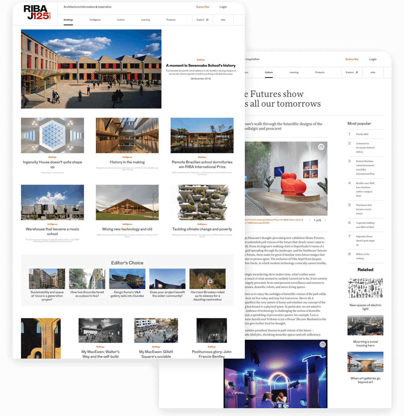
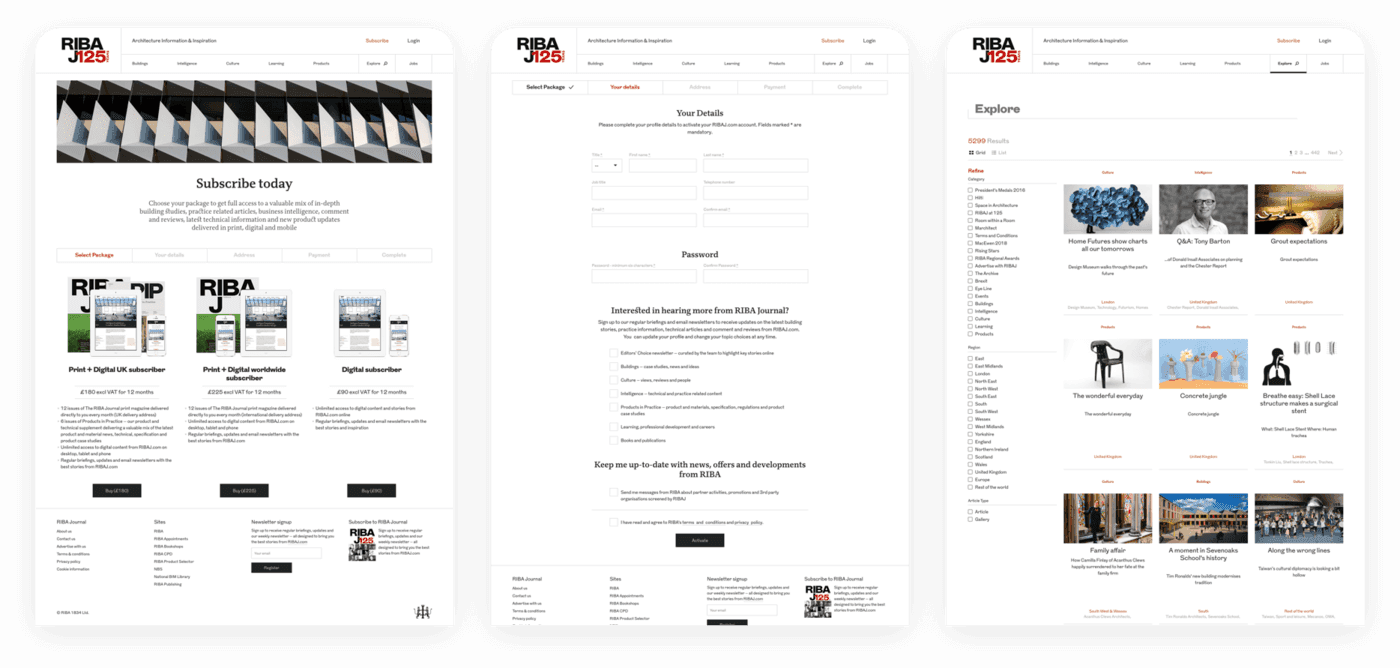
The redesign boasts a sleeker layout which links various imagery, articles and promotional slots, tying them together in a concise format which works to make use of the available space across the site.
Advertorial and editorial articles harmoniously populate the homepage, bringing a wealth of information to the foreground. Readers are effortlessly guided through key sections of the site, with the help of the new ‘Related Articles’ and ‘Most Popular’ features weaved into pages throughout the site.
Clock’s design team worked in a lighter canvas, not only introducing a fresher look and feel but also invoking starker contrasts between background and content. The end result is both sharp and clear, making for a more appealing online read.
Homepage articles have been gifted a more logical order, with the top content slots relating more obviously to the main hero image, thus facilitating the user experience and offering more easily navigable user journeys.
Dissonance was key to avoiding the typically uniform feel that can often make content predictable and tedious. Sideline promotions were introduced to ensure that advertorial pieces were displayed in a way that does not disrupt a user’s flow, and at the same time, offsets the central collection of content to create a user experience that is infinitely more modern.
Clock’s modular, award-winning CMS was built specifically for publishers with content-rich sites. Integrated for the launch of the initial ribaj.com site, the CMS now comes with increased functionality which will equip the RIBA team with more autonomy and flexibility over the mechanics and visuals of the new site.

Laying the foundations
Both teams at RIBA and Clock will continue to work closely together in a phased approach to the new site, which will pave the way for further development and enhancements. Stay tuned to see the pièce de résistance!
Learn more about our expertise in global publishing and how we support international media brands.
Related Work
You might be interested in these


